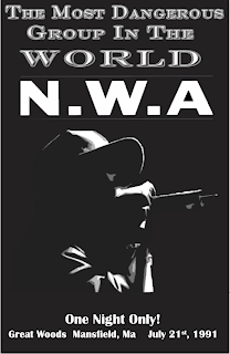
 Creating a background in the Quark program was a lot different from creating a background in any other type of program. Instead of simply selecting a color or fill for the background, I had to use the create rectangle tool and draw a rectangle that covered the 11x7 poster. After creating the background shape, a color could be selected. I chose to go with basic black, as opposed to a brighter color or some fill effect. I wanted to keep the poster simple, let the words and the image speak for themselves instead of relying on fancy colors and fonts.
For each text and picture box I created a new layer, much like in Photoshop. This wasn't necessary; however, it was easier for me to get the exact layout I wanted by manipulating each layer individually. Also, my original rough draft called for text to overlap over images, and have certain effects behind the images. It was difficult for me to achieve this without creating separate layers because I couldn't exactly control the order of the texts, images, and effects. To create an image, I first manipulated it using Photoshop. There is a way to manipulate photos in Quark, but it was easier for me to do it in the Photoshop program. After I got the image how I wanted, I went back to Quark and created a picture box, than right clicked inside the box and selected import, and chose the image. The image then showed up in Quark and I was able to move it around and change the size so that it fit the exact area I wanted it to occupy. Most of the text I created in Photoshop first, only because it was easier to get the exact effect I wanted from Photoshop, then import it as an image into Quark. Another advantage of this is I was able to change the size and shape of the text just like an image; I could stretch the words out or make them taller, without having to worry about font sizes. I did use Quark to create the text at the bottom of the poster by creating a text box and typing right into that.
One of the biggest issues I dealt with in Quark was typing right into the text box. It was difficult to change the font, size, and get the exact effect in Quark, which I why I eventually just retreated back to Photoshop. However, I eventually overcame this and managed to create the texts at the bottom of the poster, which, while not as fancy as the top text, manages to get the job done. Overall, I'm most proud of the image in the poster. It took me a long time to finally settle on what image I wanted to use. My rough draft called for pictures of each band member; however, I quickly realized that this was unreasonable. Next, I wanted to use an image of an old 1964 Chevy Impala, echoing the band's first line from their first single, "Boyz-N-the-Hood", from 1987. I used the cutout filter in Photoshop and imported the image into Quark; however, the image just didn't go with what I was trying to convey on the poster. I finally decided to use an image of one of the band members holding a mic, like they were at a concert. I used an image of the rapper Ice Cube, and used the came cutout filter I used on the Impala image. This changed the image in such a way that you couldn't tell which band member the image represented. I also changed the coloring of the image to grayscale so that it fit with the black and white theme of the poster.

No comments:
Post a Comment