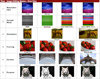
Before I even started the contact sheet I was nervous. I had never really used Photoshop before, and to be honest I wasn't quite sure what a contact sheet even was. The general idea was to take images and manipulate them in Photoshop according to the directions on the contact sheet, then drag the finished products to the corresponding parts on the sheet. The first row was Resolution. I had to take an image with 1200 dpi, or dots per inch, and decrease the dpi, all the way down to 72. I used Flickr to find an image with the appropriate dpi, which wasn't easy because most images are between 72 and 300 dpi, and professionals usually use around 600. Finally I found the image and dragged it into Photoshop. Per the instructor's request I had to make the image 1 inch tall, so that it would fit in the box on the contact sheet. To do this I went into the Image tab and down to Image Size. I learned that from here I could manipulate both the image height and width, but also the dpi. I changed the image height to 1 inch and clicked ok. Immediately my image shrunk way down. I saved it in a folder labeled Contact Sheet images, and from there dragged it into its corresponding space on the contact sheet. To change the dpi, I went back to the Image Size box, went down to where it said 1200 dpi, and changed it to 600 dpi, clicked ok, saved it, and dragged it into its spot. I did to make the image 300 dpi, and finally 72. Looking at the finished product, there wasn't really a distinguishable difference between the 1200, 600, and 300. However, there was a marked decline in quality between the 300 and the 72. The 72 dpi image was very blurry and low quality.
The next row was Format. Here I had to take an image and adjust the color. I selected an image from Flickr with a lot of color in it, so the differences would be noticeable. After dragging it into Photoshop, I changed the height to 1 inch then went back to the Image tab and selected Mode. From there I could change the colors of the image. I decided to start with Black and White, which prompts me to discard all color information. After choosing this, my image went from being a vibrant landscape to a gloomy spectrum of gray. Next I decided to select the RGB color mode. RGB stands for Red/Green/Blue and is the basic color scheme used to web images. When the image is printing, the printer will use these three colors to create the colors in the image. My vibrant landscape returned to its original color. After RGB came the more advanced CMYK mode. CMYK stood for Cyan. Magenta, Yellow, and Black. This color mode is used for professional prints as it allows for a wider and brighter spectrum of color. In Photoshop I didn't immediately notice a difference between the RGB image and the CMYK image. However, when viewed on the contact sheet, the difference became apparent. While the RGB image certainly wasn't dull, the CMYK image shined in comparison, the reds were redder, the yellows more yellow, everything was brighter and more vibrant. Finally I decided to try Duotone mode. According to Wikpedia, duotone is "a halftone reproduction using the superimposition of a contrasting black hafltone over a one color halftone." To me, a duotone is where you select two colors and the program combines them and then tints the image that color. You can use black and another color, you don't have to use black at all. First you have to set the image to Grayscale, then you can manipulate the halftones. I used a light red and a dark green, which made my image a kind of cool blue color.
The third row was Orientation. In this row I had to take a landscape image and crop it into a Square, and then to a Portrait. A landscape image is an image wider than it is tall. I chose an image of some horses grazing on a hillside, it would be easy to crop and still be a cohesive image. I set the image height to 1 and kept the width at 1.75. To create the square image, I selected the crop tool and had to adjust the size of the space I wanted to crop. Below the tabs on the top there is a space that allows you to enter the height and width you want your crop tool to be. I set the height and width to 1, and the crop tool allowed me to cut a perfectly square image of the horses. Next was Portrait. A portrait is an image that is taller than it is wide. For this, I selected the crop tool again, left the height at 1, and bumped the width down to .75 inches. The crop tool created a rectangle that size and I cropped the image down to a portrait of just a single horse.
The third fourth row was Framing. The main idea of this row was to take a picture and gradually zoom in on a single point until you have a close up. This required more skill than I previously thought. Finding a picture that would work for this exercise was difficult, the picture had to be at least 300 dpi, or else when I adjusted the height it would shrink to the size of a thumbnail. Finally I found a suitable picture of a basket of strawberries. My plan was to gradually zoom in on a single strawberry. To do this, I had to go to image size and adjust the height to 1 inch, and write down what the width was, 1.37 inches. After doing this I selected the Crop tool. Where I had before adjusted the height and width to create a portrait, square, and landscape I made the height 1 and the width 1.37. In doing this it ensured that instead of just cropping the picture it would zoom in. The first few times it did not work; it only cropped the image without zooming in. I tried putting in the dpi where I had put in the height and width and this worked. I created 4 images, gradually zooming in on an individual strawberry and each time dragged it into its corresponding spot on the contact sheet.
The 5th row was by far the most difficult. This row was Content. Using the same method in the Framing row, I had to gradually zoom in on some aspect of the picture until it became gradually more and more abstract. By the last close up it should be difficult to tell what the original image was. I decided that I wanted to do the Eiffel Tower, gradually zooming in on one of the legs or on the metal bars. I quickly ran into the same problem I had when doing the previous row; I couldn't find an image that was both big enough and had a high enough dpi that it wouldn't shrink to an unusable size. I spent the rest of class trying to find a usable image until I gave up and decided to try again the next day. The next morning, somehow the first image I saved was both large enough and 300 dpi. Relieved I dragged it into Photoshop and, using the same method in row 4, made the Eiffel Tower into a more abstract image. I zoomed in on one of the arches that forms the base of the tower. By the last picture no one would know what the image actually was, unless that had seen the original.
The final row, Purpose, was the most fun to create. For this row I manipulated the image using different filters. When selected, these filters altered the image. For example, selecting the Colored Pencil filter made the image look like it was drawn with colored pencils. I used an image of a white tiger because the contrasting white and black of the animal would compliment the different filters and make them more noticable. The original image went into the Journalistic square on the contact sheet, because it is the most realistic and would be used in print. After experimenting with all the different filters I chose Dark Strokes, which darkened the image and made the black thicker and more noticable, Graphic Pen, which made the image look like it was drawn with an artistic pen, and Palette Knife, which made the image appear blotted. For each of these filters you could adjust different aspects, for example in the Graphic Pen filter you can change the direction of the pen strokes and their thickness to create the exact image you wanted.
This project taught me a lot about the basics of Photoshop: cropping, dpi, image size, colors, and filters.


